|
AN EXCLUSIVE INTERVIEW WITH
GLEN WEXLER |
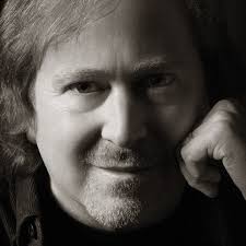 Photographer and artist Glen Wexler is known to rock fans for some of classic covers and photos he’s done over the years, most recently Heaven And Earth’s “Dig” album, as well as working with the likes of Rush, Black Sabbath, Van Halen, ZZ Top, Slaughter and many others. He’s also been heavily involved in advertising campaigns and movies (notably his logo created for Batman).
You can check out more of Glen’s work, his gallery, at
www.glenwexlerstudio.com
or order fine prints of his work at
www.bluechimp.com.
How did you get in to using your photography for album art? [I read you quit college to get into album photography / art]
When I was midway through the photography program at Art Center College of Design I was introduced to Ed Eckstein who was at Quincy Jones Productions. He brought me in to shoot the Brothers Johnson for an album that Quincy was producing. These guys were a multi-platinum act. The project jump-started my career by opening doors into the music industry. Art Center had the reputation of being the best and most prestigious photography school, but I felt that I gained the technical training, which is why I went there. I was looking at spending another year and a half in school for a degree or following opportunities in the music industry. The latter had much more appeal.
Did you have any favorite or influential rock photographers & album artists?
It was the English design firm Hipgnosis. These guys blurred the lines between illustration, design and photo to create surrealistic narratives. They pushed the boundaries further than any other commercial artists during the 70s. I learned more from their album covers about photography as a narrative medium than I did in art school.
What sort of music did you grow up on? Could you give me a few favorite bands, albums, album covers from way back?
I listened to a lot of music growing up. It was, and is, a big part of my life. As a teenager my first albums included Led Zeppelin, Hendrix, Pink Floyd, Cream, Blind Faith, Traffic, Beatles, Stones, Jeff Beck, Who, Peter Gabriel and Yes. I also got into fusion projects like Mahavishnu Orchestra, Miles Davis, and Weather Report.
In terms of early album covers, House of the Holy, Wish You Were Here, and Roger Dean’s work for Yes were, and still are, favorites.
 What were some of your first rock album or band shoots or covers? And what was your first huge name act?
I originally shot a lot of big R&B artists like the Brothers Johnson, Chaka Kahn, Gladys Knight and the Pips, and LTD. Shortly after that I worked with several New Wave bands including Missing Persons. That cover was pretty iconic. Lady Gaga ripped it off a few years back. By the mid-80s it was a big mix of rock, pop and jazz. I started working with Michael Jackson in 1984. There was no one bigger than that. During this period I was also working with bands like Kansas and a couple years later with Rush, Yes and KISS, as well some legendary jazz musicians including Herbie Hancock and Chick Corea.
You're known for making photographs of improbable realities. How is this achieved or worked out in most cases?
It starts with the idea. It’s then pre-visualized and broken down into manageable elements, which are individually shot, and finally seamed together during the post-production. I incorporate props, sets and CGI, and I have thousands of skies and backgrounds in my archives. I originally created the work using conventional multi-exposure and darkroom techniques. I was quick to embrace digital image editing starting in 1987, with access to the first Quantel Paintbox in North America...very high-end stuff. This was well before Photoshop.
Over the years you’ve shot numerous bands, logos and non-music [movie] logos etc... Can you share any tales into a few of the bigger rock acts you've shot, as well as some of your favorite movie logos, etc.. [Batman]?
In term of tales, I wouldn’t know where to start. The Batman logo was a great project. I also shot the logos for The Stars Wars Trilogy and the 75th anniversary logo for Universal Pictures. My favorite logo treatment was for Geffen Records. It was for their “Power Surge” campaign to promote the heavier bands on their roster including Guns N Roses and Whitesnake.
 You did the photography for Rush's "Hold Your Fire" album. How did you come to work on that project and who's idea was the inside photo [flame juggler]? Can you give me some insight as to how that all went? And did you work on any other Rush covers or projects?
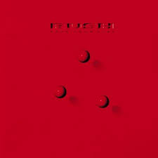
“Hold Your Fire” was my only Rush cover. In the mid to late 80s Hugh Syme and I collaborated on several projects. Hugh worked with Rush as their art director from very early on. We were both art directing conceptual album covers, although I was creating the images with photography, and at the time, Hugh was primarily a painter. The collaboration was an interesting and productive mix.
I often worked with miniature sets, and suggested the approach for staging the fire juggler. Many of the miniature buildings were recycled from a Yamaha advertising campaign featuring Michael Jackson, which I had created a couple years prior. I brought in my set team, who built a very impressive set, but very small, only four feet across.
I cast the fire juggler, this great character actor, Stanley Brock, who’s mostly known for his role in the film “Tin Men.” We originally had Dennis Hopper on board, but kept running into scheduling conflicts.
I shot the miniature street scene in my studio on 4x5 film. The other elements were shot medium format with a Hasselblad. The fireballs are a basketball that was coated with rubber cement and torched. The dog, full size fire hydrant, and actor were shot separately. I combine all the elements with multiple exposures on 8x10 film in my darkroom, which was the primary method I used to combine images pre-digitally. When everything was combined together on one piece of film, it was sent out for a dye transfer print and final retouching, which was the typical workflow back then.
In the original version, we also flew in the boy who modeled for Hugh’s painting for the “Power Window” cover. He was seen looking out of the apartment window, but it was decided that he didn’t really enhance the shot...there was so much going on. Earlier Rush covers are referenced in the image, and “Power Windows” was covered by the period TV sets in the room.
In hindsight, both Hugh and I regretted using that image in the inside of package. It was a little too “clever” using the three red balls for the cover, and leaving the more epic and memorable image for the inside of the packaging. While it might not look like it, the cover with the red balls is photography, as well. I had my set guys physically sculpt the RUSH text into a 4’ x 8’ surface that was then painted a high gloss red by an auto body shop. The printer combined the red billiard balls during the pre-press. I still have the set piece in my garage. I thought it would make a cool door.
 Van Halen's "Balance" was a very underrated album, and the cover was quite memorable. What do you recall of this project -- how it came about? curious - in this instance [and most] is the cover done after hearing some of the album tracks or separately with just a title or suggestion or even ahead of time then requested? Again, what did you think of that album - musically and the package?
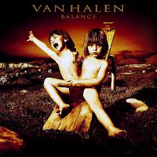
That was one of my all time favorite projects. I did the cover for their previous release, “For Unlawful Carnal Knowledge,” but it was a fairly simple logo treatment. On both Van Halen projects, Jeri Heiden, who headed the legendary Warner Brothers Records art department, commissioned the work. Alex Van Halen was involved with both covers as the “art guy” in the band.
I was originally asked to develop concepts around the title “The Seventh Seal,” one of the album tracks. We started to move ahead with a concept, but the band changed their minds about the title, switching to “Balance.” When I asked Alex about the band’s thoughts surrounding the new title, Alex had this notion of exploring the duality of the human psyche. It was very unexpected when he made the suggestion. Van Halen was perceived as being a fun-loving party band, and in contrast, this was a very smart, introspective and challenging concept to visualize. That said, in terms of Van Halen’s growth and maturity, 17 years after the huge success of their first album, it would make perfect sense that the band would want to reveal a more complex side of their personality, including reflecting on the some of the deeper issues that they were experiencing.
I produced several rough sketches to illustrate the concept, including the conjoined twins on the seesaw, which would be created by combining photographs of an androgynous child who I found when casting for the “Seventh Seal” concept. Other than the obvious expression of inseparable male and female characteristics, the realization of the idea began to focus on a number of ironies…the impossibility of the conjoined twins actually playing on the seesaw, the “calm” twin actually being the aggressive one, pulling the hair of his sibling to create the appearance of an aggressive child, and no one else to play with in the desolate post-apocalyptic setting, in which unusable playground equipment is the only object in sight. I also had the opportunity to “design” the twins to mimic the shape of the “VH” logo. Jeri and Alex agreed that the seesaw approach was the strongest direction.
I was always in awe of Ed’s playing. I directed a short film version of the album cover bringing it to life to close the show on the Balance tour. This gave me the opportunity to be out on the road with them, and gain a huge respect for their talents and how hard they work.
It was great to reconnect with Ed several years later. I really like him on a personal level. Both my son and Ed’s son Wolfie were schoolmates, which brought us back together. He gave my son his first electric guitar.
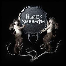 Black Sabbath's "Reunion" was a huge release in the band's career, marking the return of the original line-up. Can you give me details on how this came about and where the idea of the 2 girls on the front, logo, etc.. came from? And did you get to meet and talk with the band or label as to how things would be? And was this the only Sabbath project you worked on?
That was my only Sabbath cover. I was originally contacted by Sony to create a logo. The label knew this was an important release and wanted a logo that reflected the legacy of the band. They also saw this reunion as a milestone, especially significant at the approach of the new century.
The label asked for type treatments only. I did several versions, but I also had this vision for a post-industrial coat of arms. When I went into the record company to present the work, the creative director liked my sketch for the coat of arms ideas, but it was immediately shot down by the product manager who insisted it was “too aggressive,” and reflected Ozzy’s “old image” which he believed needed to be sanitized. Whatever. Luckily, Sharon was at the meeting. She didn’t say much during the meeting, but asked to walk out with me to the parking structure, at which point she said, “We’re fucking going to do your album cover.” She decided not to deal with Sony Music and take it straight to the merchandising guys to finance. Very smart woman. I have huge respect for
her.
You've also done covers for ZZ Top, Slaughter,.... any other heavy rock acts? And do you have any favorites from an artistic or personal standpoint?
I’ve done covers for a number of heavier bands... MSG, the first three covers for House of Lords, Y&T, Whitesnake, Bad Moon Rising, Impelliterri, Lillian Axe, Unruly Child, Contraband, to name a few.
What Whitesnake cover did you do, and did you work with David (Coverdale)?
I created the photographic version of “Trilogy” (DVD release), with a sculpted logo/emblem on black marble. “Whitesnake” was etched in the stone and gold leafed. I don’t have it scanned, and the versions I found online are all bastardized...they don’t look at all like the original art. I’ve been meaning to have the original scanned...it looks great...very dimensional.
It was created in ‘87 shortly after the release that first introduced the logo. That was a painting by Hugh. The original painting/canvas hung in my office for a couple years...cool piece. I didn’t work direct with David. Whitesnake was Hugh’s client, and the logo was his design. I just created the photographic interpretation.
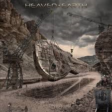 Most recently you did Heaven & Earth's "Dig" album. That is such a fantastic cover and concept (I had to get the 12" vinyl)! Where did that whole idea with the guitar being unearthed come about? And how big of a project was the Dig cover for you?
Thank you. In terms of album covers, this was an ambitious project, especially for an indie band. I was pitching covers to Heaven & Earth for a fraction of the budget, but the guys kept asking for bigger ideas, and they are fortunate to have independent financing. I told them about a concept that I developed for the Led Zeppelin “Mothership” compilation, which Robert Plant and the label loved, but was eventually shot down by someone on Jimmy Page’s team who wanted a Sheppard Fairy cover. The Zeppelin version was very similar to the Heaven & Earth design but with a tethered Zeppelin rising out of the dig. It was about the almighty Zeppelin, still powerful and rising after being uncovered eons in the future.
I had also just finished a CGI animation for Tom Scholz and Boston bringing their classic guitar spaceship to life. Originally, Tom liked the idea of doing an update to their spaceship to give it more of a detailed “Prometheus” vibe, but at the end of the day he really wanted to stay true to the original classic spaceship as illustrated on their first album cover.
As part of our exploratory development for Boston, we created a cool CGI spaceship version of a Les Paul as a test. Heaven & Earth’s cover developed into a mash up of the Zeppelin and Boston development, but I changed the guitar to a Strat, which is what Stuart Smith plays. It’s a totally original piece of art, but often the ideas are around for years, and it’s a matter of finding the right iteration and a receptive band or label to actually realize the art.
The main thing is that it was the right idea for the project. My original take on the music is that is sounded like a Free or Deep Purple album that was lost in the vaults for 40 years. The underlying concept of the album art shifted to the “unearthing of rock and roll.”
I was at the printing press in Montreal to supervise the quality control and to dial in the printing. It was an absolute rush seeing the uncut LP press sheets coming off the press, as well as seeing the excitement of the printing crew over this cover, which was very cool considering that they print thousands of covers every year.
You were responsible for suggesting the album title and played a big part in the whole project with the photos, the video, etc... You must have a good connection with those guys and/or really like the album!?
Chuck Wright (who has since left the band) was the bassist on the album, and is one of my closest friends of over 30 years. He was in the very first band that I shot for a school project. He recommended me for a band shoot and the album cover. I thought I would get in and out, but I ended up as their creative director producing the original art assets and directing the videos.
It’s also a great album. I think Joe Retta is one of the best vocalists in rock, and an amazing front man. He should be in the limelight and getting a lot of attention as the face of the band. He is a genuine rock star.
Any favorites from Dig or plans to work with the band again?
Love “House of Blues,” and “I Don’t Know What Love Is” is a killer ballad. All of Joe’s vocals are amazing. Love Chuck’s fretless bass on the ballad, and Arlen’s B3 performance throughout the album and on stage is staggering. The overall production is great. Stuart and the guys did an excellent job in crafting this album. 20 years ago, with major label support, and a conduit to radio and MTV, I have little doubt that this album would have been multi-platinum within the first year.
In terms of working with the band down the road, we’ll see how things play out. I’d love to see these guys succeed. As of now, it’s like they built a Formula One car that’s at the starting line waiting to be fired up.
 What's your take on the state of album art these days - with either CD format or digital downloads. Has this taken away from the whole art concept from your point of view? Or do you still see a demand from fans and artists for classic album art [such as with Dig]?
These days, most fans expect to get music for free, which has devalued the importance of the album art in the minds of many on the business side. The music has become the band’s calling card, and many bands and labels are unwilling to support the effort with the necessary investment into a strong visual representation. Unfortunately, this perspective is shortsighted. Of course, there are exceptions with top grossing artists working smartly to keep their brands relevant with realistic investments into packaging and videos with lots of production value.
The album art is just as important as it ever was in creating a visual expression of the music, and for establishing a brand/consumer image of the artists. The supporting imagery will never cease to be a powerful and valuable marketing tool, even if it exists only in digital media.
If emerging artists win over the fans, the fans demand merch and packaging that connects them to the band. Better yet, once the fans are engaged, the social media numbers blow up and this creates awareness to attract licensing opportunities, which potentially generates significant income. The album cover helps to establish a lasting impression, and reflects the quality of the production.
My other take away of the overall state of the music industry is that too many people run interference with the creative process required to create great covers and other visual assets. There use to be a much greater respect for the unique skill set, expertise and value that a proven visual artist brings to the party. We were allowed the freedom to do our job and deliver our best work. These days, too many people connected to a band, or the artists themselves, believe that they are qualified to make the creative decisions and handle the nuances of achieving quality production results. Too often, I’m reminded of Nigel Tufnel (Spinal Tap) handing over a napkin sketch for an 18” Stonehenge set prop and then becoming outraged when discovering how small it turned out, despite his specific directive. And, there is Spinal Tap’s conceptualizing for the album cover of “Smell the Glove,” which is meant as satire, but I can assure that this could have been a very real discussion. Sadly, very few have the self-awareness to realize how much they are unnecessarily compromising the outcome and the band’s image.
On a positive note, it is great to see the huge increase in vinyl sales over the past few years. I think much of this is the pendulum swing of a generation growing up listening to compressed music through shitty ear buds. The experience of immersing into the music with an actual 12” album on a quality sound system is surpassed only by the live show/concert experience.
Is there more covers you've been involved in from lesser known acts or releases [that aren't mentioned on your site]?
There are quite a few indie bands that have given me great opportunities. The recent cover for Dilana’s “Beautiful Monster” is one my favorites and an incredible album. It was produced by Jack Endino who worked with Nirvana and Soundgarden. She funded the project with a modest Kickstarter campaign. She’s an amazing talent and deserves to be a household name.
I’ve done two covers for True Nature, also a great indie band...kind of blend of U2, Pearl Jam and George Harrison. Tony Levin (Peter Gabriel and King Crimson) who plays bass on the albums initially caught my interest, but very strong writing as well. I did a cool project a few years back for the band Oslo, featuring Gabrial McNair, who also plays with No Doubt.
There were a couple album covers a while back for Capitol Records...great projects for Stir and Thanks to Gravity. “This Way Up” for Brian Ray, who plays guitar with Paul McCartney was a fun project, and there was an ambitious album cover for Shaquille O’Neal, my only rap project to date.
I’ve created several covers for a New Age series called Liquid Mind. These are albums by Chuck Wild, a Zappa alumnus, who I met when he was playing keyboards with Missing Persons. I’m just starting work another, which I think will be my ninth cover for the series.
I created one my favorite pieces for a fantasy album cover exhibition at the Rock and Roll Hall of Fame & Museum, called “The Greatest Album Covers That Never Were.” I did an image titled “Sold Our Soul,” which was a concept I pitched for a couple projects. For the exhibit and coffee table book, it referenced my work with Black Sabbath.
There are other covers that were not released for one reason or another. I did the original cover for Poison’s “Open Up and Say Ahh.” I was commissioned by Capitol and worked with Rikki Rocket on an image with a top model, but it was killed because one of the other band members promised the cover to his girlfriend, and he personally had the concept reshot.
There was a cover I created a couple years ago for N.I.N.A. on Warner Bros, which I love, but it’s dead in the water. The project has changed direction countless times and has been on a perpetual hold.
What other projects do you currently have on the go? Any album covers in the future? Movies or ads?
My favorite projects are album art, but advertising pays most of the bills. This past week I finished a very large shoot for Allstate. We built a 3/4-scale house on one of the stages at Paramount. Right now, I’m working on the Liquid Mind package, and the conceptual development for a possible album cover for an icon from the 80s. I’m also developing a feature film project, which is, of course, a much longer-term project.
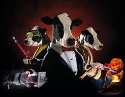 What is your fascination with cows and how your cow photography [secret life of cows] came about and represents?
“The Secret Life of Cows” grew from an accumulation of advertising projects. Stripped of the advertising context, the series represent a species ineptly fighting for its survival. Something that a lot of us might relate to...
It started with UFOs. In the 90s, I seemed to be the go-to guy for any large-scale advertising shoots with a flying saucer. Around 2000 I shot an international ad campaign for Sony of an elderly farmer couple with a camcorder shooting cows disembarking a UFO hovering over a cornfield. Now, with cows in my portfolio, that opened doors to shooting livestock. I was approached a couple years later to create a calendar of Bovine Superheroes, which was hugely successful, selling millions of copies. The next year I was commissioned to create another calendar of Super Agent Cows. The work received a lot of press and industry accolades, which led to a book deal and an art exhibition, and a lot more press. The book was a fun project. Eric Idle from Monty Python wrote the foreword, and it includes a parody of the album cover for “Meet the Beatles” recreated with cows.
Reviews:
© Kevin J. Julie (Universal Wheels) March 2014