|
An Exclusive Interview
with artist |
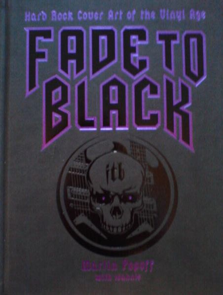
Known simply by his first name to many rock fans, and in particular Uriah Heep fans these days – Greek born (and American raised) Ioannis has been doing album art for years, and his list of clients has included numerous classic rock and metal bands. Having drawn and designed covers for such names as Deep Purple, The Allman Brothers, Saga, DreamTheater, Quiet Riot, and dozens more, in more recent years he has done a good list of Uriah Heep covers – the latest studio albums, as well as the band’s ‘official bootleg’ series. And he’s also just been a major part of the Led Zeppelin book "Get The Led Out" (with author Denny Somach), as well as "Fade to Black : Hard Rock Cover Art Of The Vinyl Age"; a collaboration with Canadian rock journalist Martin Popoff. Enjoy this read as Ioannis gives a good bit about his beginnings as an artist, how he got into the art of album covers, as well as his latest projects.
For ordering information, Ioannis' artwork and a gallery of album covers; check out: www.dangerousage.com.
 How did
you get in to album artwork specifically?
How did
you get in to album artwork specifically?
First of all hello to you Kevin and it’s a pleasure to do this for your magazine, I was a fantasy sci-fi fan as a child, always drawing making my own comic books lol, I got into rock n roll as a teen, as a matter of fact Demons and Wizards was one of the first albums I ever owned in 1972 as a Christmas present. I originally wanted to become a comic book artist and have done a few in the early eighties. In the summer of 1975 I remember going to my favorite record store, my friend there Bob showed me a book they had just received. Back then this was very unusual as record stores didn't carry books.
"It's the guy who does the art for YES " he said "Roger Dean" it was the book VIEWS, I took it home and did not put it down for weeks, all of a sudden all the dots connected for me, I was going to be a record cover designer, the perfect marriage of my love for art and music. By the following summer while still in High school I had started to do concert posters for the local clubs and then logos for local rock acts, I then got commissions for professional metal acts in the early 80's as I was in college it snowballed from there as graduated to a freelance art director and was responsible for the whole campaign not just the cover.
In the end it’s still a very simple equation, I collaborate with musicians and try to create images to interpret their music
Were many of your earliest favorite artists in the music field as well?
Like I mentioned a big fan of fantasy artists although a number of them crossed over to record cover art as well, Roger Dean, Rodney Matthews, Chris Achilleos, Frazetta. Ken Kelley, Peter Loyd, Shusei Nagaoka, Kelley Mouse studios and H.R Giger, in the album design field one of my most strongest influences was Storm Thorgensen and Aubrie Powel of Hipgnosis.
 What
were some of your favorite albums, bands,... [musically] growing up? and did
album artwork really have a big influence on your record buying back then?
What
were some of your favorite albums, bands,... [musically] growing up? and did
album artwork really have a big influence on your record buying back then?
Good question, album art did influence my record buying as long as it reflected my musical tastes, I was blown away with The art of YES, ELP, PINK FLOYD and so on, as far as my tastes it evolved from hard rock, BLACK SABBATH, DEEP PURPLE, URIAH HEEP, early QUEEN, LED ZEPPELIN, to progressive, ELP, GENTLE GIANT, GENESIS, YES, PINK FLOYD, KING CRIMSON to eventually electronic music TANGERINE DREAM, BRIAN ENO, ORB, FUTURE SOUND OF LONDON and so on.
Aside from your own LP covers, has there been many covers that may have inspired you to buy the album, but then were a bit disappointing musically? [or the cover and music were totally unsuitable to each other]?
Yes, actually, although a great album can lift ordinary artwork to legendary status, Deep Purple Machine Head or Zeppelin IV or Queen a Night at the Opera. Also it’s true that sometimes the wrong image is used, of say a very heavy metal image that is applied to a melodic rock band and so on. I think it’s very important that proper imagery is designed for a band, and I am disheartened to see when a band spends so much time crafting a great piece of music, and is so casual or careless when it comes to their cover art. It is such an important part to a fan and if done successfully can be very lucrative. Look at YES, IRON MAIDEN, PINK FLOYD the amount of merchandise sold and impression of their image to a fan, all because they worked with talented artists and designers and allowed them to continue concepts forward.
 Has
technology played a big part in how you do album covers nowadays? [i.e. using
computers perhaps, as well as putting together a cover for a CD as opposed to
a gatefold LP] [see above] — do you think technology [and the CD cover] has
taken away from the 'art' of the album cover? [on occasion or by and large]
Has
technology played a big part in how you do album covers nowadays? [i.e. using
computers perhaps, as well as putting together a cover for a CD as opposed to
a gatefold LP] [see above] — do you think technology [and the CD cover] has
taken away from the 'art' of the album cover? [on occasion or by and large]
Yes, actually but I think it’s been the opposite as very positive, (with the exception of seeing your art in larger size) perhaps because my career professionally came into full swing in the late 80's. However I like many of my contemporaries feel similar. In the 70's the artist only had to concern themselves with the front cover image, some credits and simple liner notes for the back cover perhaps some lyrics in the inner liner bag and that was pretty much it for the majority of acts. Not everyone was Pink Floyd and could command a gate fold, posters and sticker inserts. When the CD was introduced at first album cover designers did not know how to deal with it, however it forced the designer to think in 3d terms as how the whole concept would relate not just the front cover. Soon there were all types of things, booklets, digi-paks, media books, box sets, etc... It made the design process more involved and I think fans got more, an example for me would be my cover for KING CRIMSON The Construktion Of Light. Actually it became much more lucrative for the designer as a lot more work was required. As far as technology it just added to the palate of the artist designer.
I worked in airbrush, inks, and acrylics, later in photo-shop and shooting live photos. In the end it’s about the right image, not the technique I remember the late seventies you did not look at a Hipgnosis or Roger Dean image and say "nice airbrush" you said what a great image. However there were many artists that when the art was shown it looked like a how to airbrush course, same today with photoshop, a lot of the stuff looks not well thought out and fake and it hurts the final image.
As far as technology itself, again it’s made things quicker to execute, I remember before the computer and layout programs, it took forever to layout the designs, get typesetting, and approvals and await for a final look after films were shot as the art was separated, you better had to have a great sense of how it would all work out otherwise the first time you would see all the components mesh (cover, logo, title, etc..) was when separations were done and thousands of dollars had been spent. If it was a disaster it was on your head.
 Aside
from your many works with Uriah Heep - what are some of your works that you
are happiest with? And some of the band associations you've been most pleased
to be a part of?
Aside
from your many works with Uriah Heep - what are some of your works that you
are happiest with? And some of the band associations you've been most pleased
to be a part of?
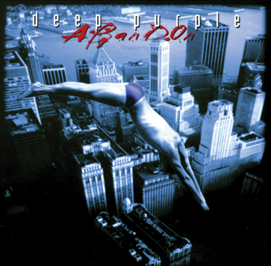
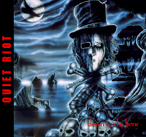
There has been a number of them , ALLMAN BROTHERS, STYX, DEEP PURPLE (although I will not be doing the new one), LYNYRD SKYNYRD, FATES WARNING, and so on, all wonderful memories and great musicians. As far as specific covers other than my work for HEEP I still get emails and compliments for FATES WARNING AWAKEN THE GUARDIAN, DEEP PURPLE ABANDON, ALLMAN BROTHERS WHERE IT ALL BEGINS, KING CRIMSON THE CONSTRUKTION OF LIGHT, STYX BRAVE NEW WORLD, QUIET RIOT DOWN TO THE BONE , it’s very heart-warming fans pay attention so much.
Can you tell me a bit about the "Wake The Sleeper" cover? I think that is a great Heep cover. And where did the idea to use the Buddha on it come from?
Thanks, I was originally contacted by Mick in late 2006 after he had read an interview in Record Collector, and also an introduction by his web designer. We started to discuss the ideas and I remember the manager telling me that this was its own band and that he didn't want a comparison to the 70's act and thus to stay away from Roger Dean type of imagery. I tried to oblige but thought that Dean's iconography was such an important part of their heritage that to completely turn their backs on it was not a great idea. Anyways like I mentioned earlier, I was a huge Dean fan so I didn't mind that certain elements creeped in.
The original idea by their then manager was of a powerful locomotive coming at you head on, I worked on that but also submitted my other concept, the Buddha. I love and am a huge fan of Asian culture, my wife Lisa had bought me this old book of images from Thailand in an antique shop as a gift. I came upon the image of the buddha and decided to do an illustration of it, Mick had told me how much he loved the far east and I thought this added to the mystery, the Buddha looks like he is about to come to like and thus move forward just as the band was about to do, or is it the dragon at the bottom of the statue, leaving it to the fans to interpret. Incidentally for me it’s one of my favorite pieces i have done for them, with Live in Kawasaki from the bootleg series a close second.
 You've done a number of covers for the Heep live releases series. What is the
process when it comes to doing such covers, as in what info you're given, any
ideas, and how long each piece may take you?
You've done a number of covers for the Heep live releases series. What is the
process when it comes to doing such covers, as in what info you're given, any
ideas, and how long each piece may take you?
The project was the brain child of Daniel Earnshaw who works in the management office, the idea was to do a limited edition high quality collection of live official bootleg concerts, with proper packaging, good recordings and a central theme, i think when you put them next to each other, you can see it, also when you combine the spines in order of releases you will see an image forming.. . I usually get a month or so to create the image and package and the process is the same as doing an album release, although the band usually is more relaxed on the approvals and lets me more or less do as I please, although I do get strong input from Daniel. I am pleased how its moving ahead as it will be a definitive chapter in URIAH HEEP history, currently we are doing six, but there is talk that the set can extend to twelve or twenty four.
I'd read that you' heard Heep had considered using Roger Dean again for the last album [Into The Wild]!? If so, I thought that was interesting, as at first appearance I thought the ITW cover looked like something Roger might do [with reference to the rocks and nature scene]
It's something that was considered for a brief moment, as the management company also represents ASIA and has a good relationship with Roger also there was a new record label coming onboard at the time FRONTIERS. I did think it was interesting as i had been told like I mentioned earlier to steer away from such imagery, also that i think for the first time in a long time URIAH HEEP in the last five years had developed a consistent image because of the amount of work i have done for the band. Now don't get me wrong I am not self-congratulating myself, i think any proper designer could have done this as this is the rewards when you stay consistent with a proper look, again look at IRON MAIDEN. If Roger was to come back, then I would be more than happy to hand the reigns back to him, I am in awe of the guy.
As for the imagery of ITW the idea was to continue the concept from WTS, there were many elements that were there, although in the end the band decided to omit them. I think what works well for ITW is that the design enhances the strength of the cover, If it was the illustration by itself without the circular theme, symbols, new logo design, etc.. it would be too plain. As far as similarities, I have a passion for land scape art as does Roger although he uses it as an opportunity to showcase his architectural designs, and rock formations.
Do you have a few favorite Heep covers [aside from the ones you did] and why?
God mine are not my favorite Uriah Heep covers LOL! There are a number in chronological order
THE FIRST URIAH HEEP ALBUM the US version with the serpent, strong drawing at such a early period.
URIAH HEEP LOOK AT YOURSELF gimmicky but very effective, again prefer the US version.
URIAH HEEP DEMONS AND WIZARDS , great painting by Roger Dean the band had arrived.
URIAH HEEP THE MAGICIANS BIRTHDAY a great record cover design by Roger Dean that worked, an amazing album.
URIAH HEEP RETURN TO FANTASY just a great image
URIAH HEEP FALLEN ANGEL always a big fan of Chris Achilleos
URIAH HEEP SEA OF LIGHT another great painting an effective design by Roger Dean.
 You've
recently put together a book with Martin Popoff on album artwork. Curious
how this project came about, and what the whole idea or concept was to be?
You've
recently put together a book with Martin Popoff on album artwork. Curious
how this project came about, and what the whole idea or concept was to be?
Me and Martin became good friends after he interviewed me in 2006 about album cover art, we decided do some work together, we are both artists (painting a secret passion of Martin's) hard rock fans and are avid record cover collectors. Even though there are a number of books on record covers to our amazement there was no book on metal art or hard rock. So we started to put the project together, originally it was to be independently funded and self-released, Martin had done similar projects with Derek Riggs (IRON MAIDEN) Away (drummer and cover artist for VOIVOD) Black Sabbath and Judas Priest. By the time we were ready we had found a major publisher who wanted modified to Hard Rock so we can include such bands as THE STONES, T. REX, QUEEN and so on and less of the obscure acts like ETHEL THE FROG and GOTTO lol, we had a lot of fun writing it (mostly martin) and tracking down vinyl album art, photographing, and so on that was me. The only thing we under estimated was the huge amount of work involved especially from the legal side to get permissions which literally took forever. The good thing is that if we decide to do a follow up we now know what not to do.
How did you guys go about choosing album covers for "Fade To Black"? was there any criteria or how did you come up with the covers chosen? There is a wide range or album art - from band photo covers, to fantasy art, to sketches, collages, etc...
Martin ran some type of poll in his magazine Brave Words and Bloody Knuckles and the rest was his choosing with a bit of input from the publisher, our tastes were identical so I let him run with it, was happy that some of mine made it, actually some of my biggest commercial success like EXTREME PORNOGRAFITTI he didn't like LOL. The thing was that it had to be from the Hey-day of vinyl (mid 60s to 1990) and that it had to be hard rock so covers that I liked like PINK FLOYD, YES, GENESIS didn't make it. As far as the art - it was based on great art and design the medium didn't matter, everything from doctored photos to paintings, drawings whatever worked.
Fade To Black is a beautiful book, and there have been a number of album art books in the past. What did you guys try to do to make it unique?
Thanks for that, we are massive fans of the genre so we approached it from the point of the fan and what we would like to see, Martin through his many years of interviews had amassed a very big collection of info, plus I love his writing and sense of humor, we wanted an album cover format, great display of the art and great stories, plus a few odds and ends for the hard core fans, in the end I think it really came together. Took me forever to agree on a cover with the publisher! I just received word that it was picked as one of the best book designs for THE NEW YORK book fair this spring so that is cool. Fans can get the book here if interested
 You've
also completed a Led Zeppelin book? What can you tell me about that? what it
includes and how it came about?
You've
also completed a Led Zeppelin book? What can you tell me about that? what it
includes and how it came about?
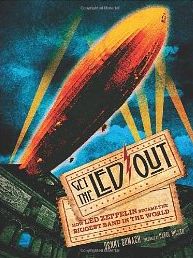
The LED ZEPPELIN project came through my good friend Denny Somach (the book's author) he is an expert on the band having met them and interviewed them many times, he also owns the American show GET THE LED OUT (the book is based on that) that airs in over 300 rock stations in America, its an hourly nighttime show hosted by famous rock DJ. Carol Miller. He approached me about the project over a year ago, Zeppelin is one of my most favorite bands however i was way too young when they broke up, this was a great opportunity to work for them sort of LOL. Me and Denny had worked on projects before so this was a good fit. The book is the ultimate account of Zeppelin's rise to the top from day one, including interviews with famous musicians and people instrumental in the bands success, I did the cover and 15 paintings from various time periods of their career, my interpretation that is, it was very enjoyable. We are now currently working next on a book of the BEATLES.
As for Zeppelin, shameless plug here, fans can purchase limited edition signed prints or a portfolio of the art from my online store at 'this link'.
What other projects do you have in the works? [books, album covers....]
I just finished the artwork for a band called PGP (Dug Pinnick of KINGS X, guitarist Eric Gales and Thomas Pridgen from the Mars Volta) great album in the vein of CREAM a did a very psychedelic cover for them.
Working on the next URIAH HEEP bootleg in the series, Started work on the next FATES WARNING out later this year, The Beatles book, redesigning the logo for www.hardradio.com; plus set up appearances and a tour of the ZEPPELIN paintings, and preparing to design the cover and campaigns of two major Classic Rock acts that I can’t divulge right now. I also am revving up for my next Kickstarter campaign which I think will be a major undertaking since it will be a multi-media experience. Things will heat up even more as the summer approaches LOL.
Interview: ©2013 Kevin Julie / Universal Wheels